HENRY IV PART I
Design Process Notes
Theater at Monmouth
director: Dawn McAndrews
sets: Michael Minahan
lights: Lynne Chase
costumes: Heather Carey
sound: Rew Tippin
Harsh Glare
Ideas from early design meetings:
This is not a history play
It is about father and son
Steampunk (combining the old with the new)
Sherlock Holmes
Light sources on stage
Unit set with minimal scene changes
Light will change our perception of the space to indicate different locations
The Light sources on stage idea
We had discussed the idea that Steampunk was an amalgamation of old objects repurposed for new uses. I suggested that we could use some of our rusty fresnels on stage as footlights. The idea seemed right for a show featuring war battles. I mentioned that, in keeping with the Steampunk idea of using old objects, several of our stock fresnels looked like "they were made a while ago!" Laughter ensued.
The scenic designer wanted to supplement this idea with bare bulbs, which was another "bright" idea.
We did both ideas. Below are some examples.
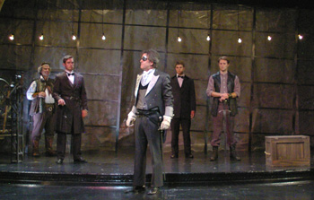
Bare bulbs
These proved versatile. They worked for creating both a harsh set of points for the castle scenes as well as helping to establish the warm environment for the Boar's Head Tavern.
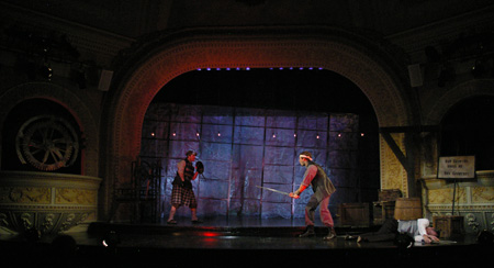
Red footlights for battle
The unnatural angle, the saturated color and the moving shadows created by the performers all helped support the high stakes of these battle scenes.
The Sherlock Holmes idea
In response to this idea, I watched several Sherlock Holmes movies. Hounds of Baskerville1 had the most intriguing visual ideas. Hounds contained many scenes in which a bright window in the background partially silhouetted the characters. Characters appeared with darkened, shadowy faces, though still completely visible.
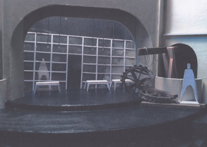
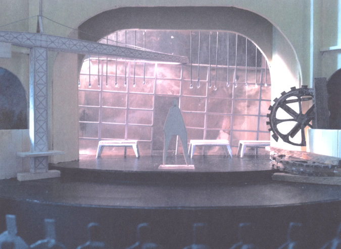
Set designer Michael Minahan came up with a "window wall," which provided the opportunity to give the space multiple personalities. What follows are four model photos from varying stages of the design process. Some of these visual ideas ended up in the finished production and others mutated into something different. But, the idea of an open wall with a surface that could take light remained. Michael's lighting of the model suggested light similar to what appeared in Hounds as well as suggesting some color thoughts suitable for this world.
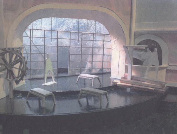
Though the idea of plastic morphed into window screening, this photo captures the idea of lighting a surface upstage to influence the look of the space.
Set design, model construction and photo by Michael Minahan. Used with permission.
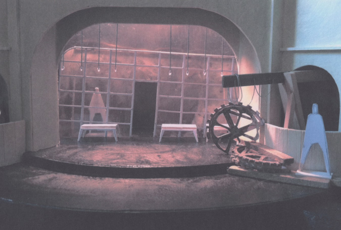
Color can also add character to the space.
Set design, model construction and photo by Michael Minahan. Used with permission.
Putting no light behind the wall creates a very different space.
Set design, model construction and photo by Michael Minahan. Used with permission.
This photo has the diagonal back feel to it, in addition to emphasizing the bare bulbs that became quite versatile in lighting the show.
Set design, model construction and photo by Michael Minahan. Used with permission.
The diagonal backlight was especially useful for Henry's castle. This bright light caused the crumpled window screening to glare, giving the stage a harsh and bright atmosphere. It supported the dictatorial authority of the reigning monarch.
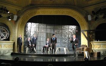
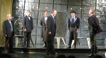
The bare bulbs are in use here. There is also a footlight component in this look.
The Shape of the Production
With these ideas as jumping off points, I developed the following thoughts about the scenes and their relationship to each other. This was a collaboration with the director. The scene titles are hers.
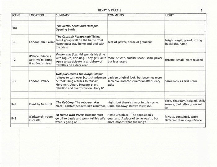
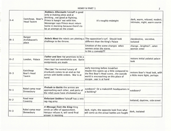
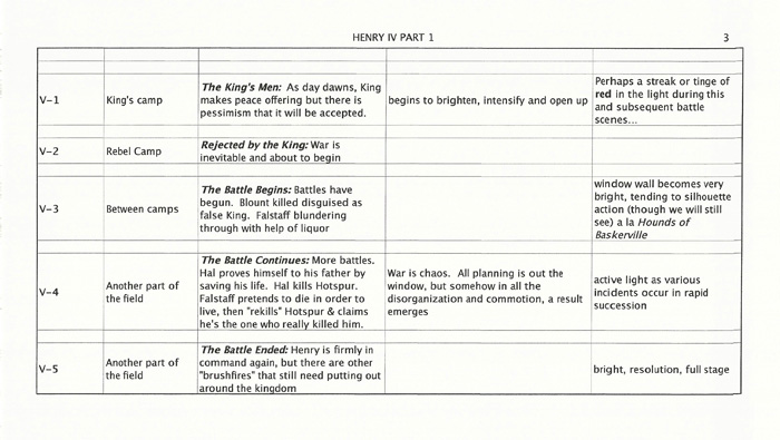
Putting it All Together:
The Light changes the space idea
The scene transitions involved minimal movement of furniture. Light played a huge role in transforming the space into different locations.
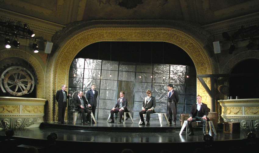
Henry's Palace is glaringly bright, harsh and regal--a metal environment with the strength and grandeur of the ruler's haunt.
(Though this photo does show that the scene was bright, let me repeat...it was bright!)
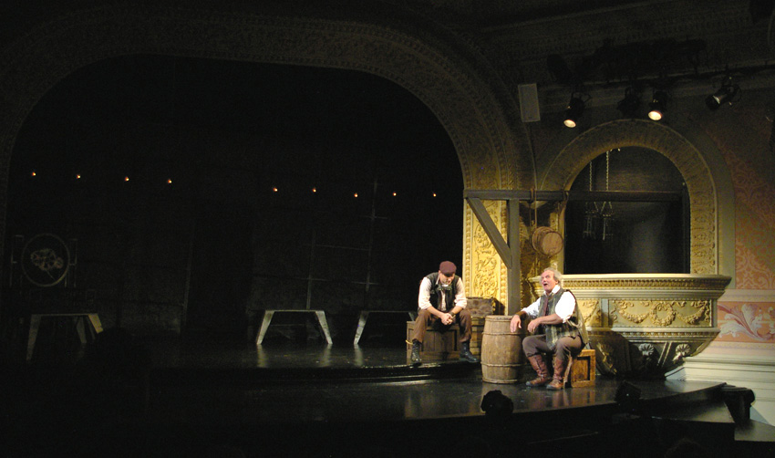
Boar's Head Tavern: with action focused at stage left, different lighting and wooden furniture makes
a warm, cozy, dimmer, more relaxed and intimate tavern feel.
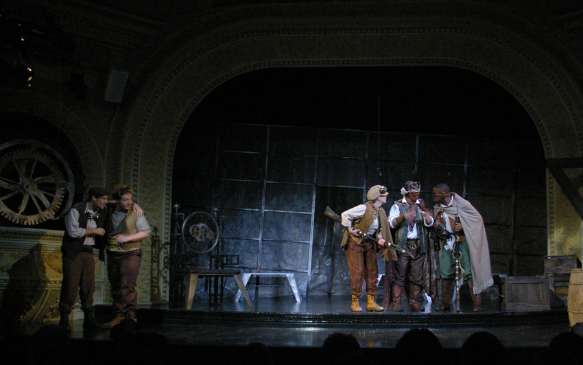
Road by Gadshill: Same set, different light. Now we are outside on a dark, shadowy, chilly night.
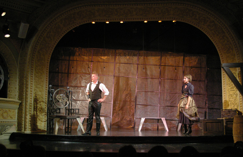
Hotspur's house, wealthy, but more modest than the King's Palace, had color that was inspired by the colors in the set model photo.
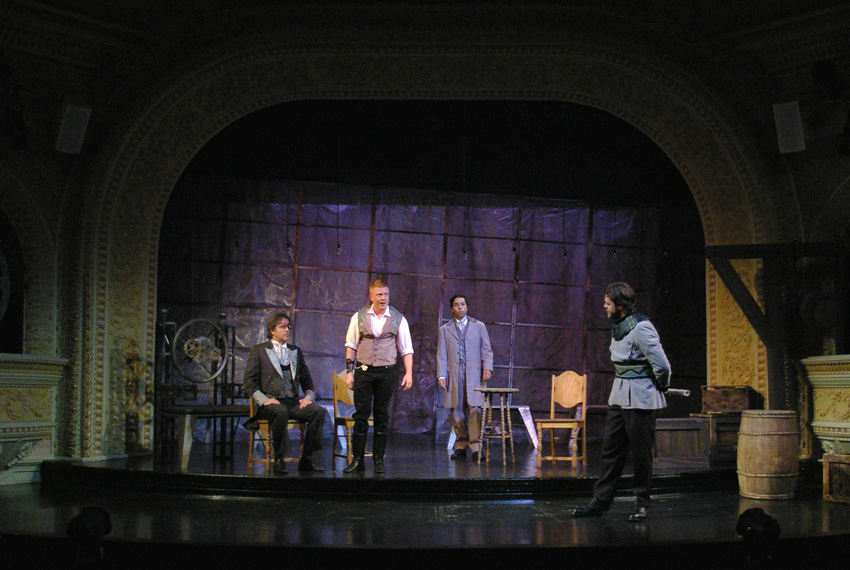
As rebels plot strategy, the color again aids in setting this isolated, clandestine meeting apart from other locations.
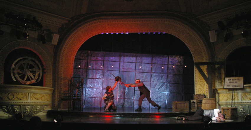
Battlefield: Here's a good example of ideas mutating in the production process. As you can see from the scene breakdown above, I had been thinking of using the harsh diagonal backlights for the battle scenes. That idea ended up working better for Henry's castle. Instead, I supported the high stakes of the battle scenes with a more exterior, more unnatural look using the Steampunk inspired fresnel footlights.
See the HENRY IV PART I gallery page for many more examples.
Return to Process Homepage
