PERICLES
Design Process Notes
Theater at Monmouth
director: Jeri Pitcher
sets: Dan Bilodeau
lights: Lynne Chase
costumes: Jonna Klaiber sound: Rew Tippin
Highlights in the Darkness
Director Jeri Pitcher opened her notes about this show with:

Used with permission
The lighting journey was equally intriguing:
Sculpting side light, pale blue uplight, purple tournament light, darkness, shadows, accents, obscuring light, revealing light, stormy light. And that's all before intermission!
After the interval: Red light, golden light, back light, the shadows of the brothel, the brightness of Ephesus.
What a dream for a lighting designer to be able to create this fantasy world!
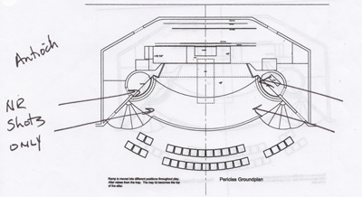
The shape of the lighting journey evolved from an assemblage of sources. We studied research images from the book Julie Taymor, Playing With Fire.1 Jeri also provided some descriptive ideas in her directing notes. Using these sources, I generated some descriptive adjectives of my own, which I showed to Jeri. We agreed that we were on the same page with these. As I observed staging in rehearsal, I generated quick sketches of angle ideas drawn on set ground plans.
Listed below are some of the show locations and the ideas (adjectives, sketches and research images) that shaped their lighting looks.
Antioch - Dark Tyranny
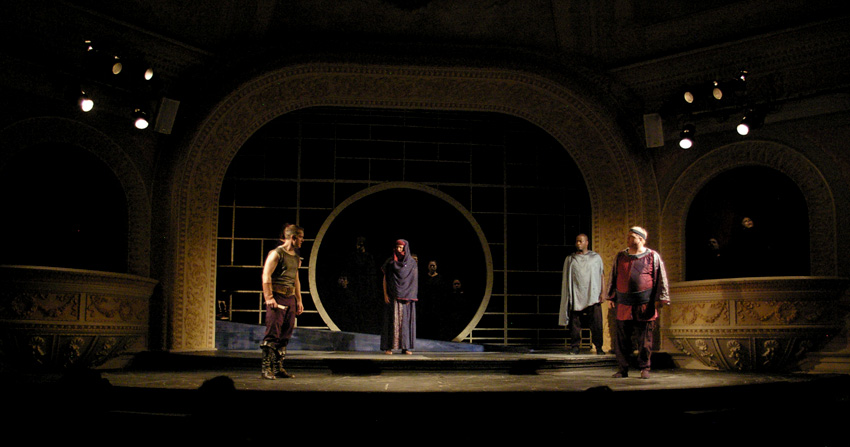
Research images: There were two images from Blumenthal and Taymor that were especially helpful to me. The first is an image from Theatre for a New Audience's 1994 production of Titus Andronicus. It depicts several armored performers in a dark environment lit from a diagonal in front and behind. This light sculpts them while preserving the dark atmosphere.
Director notes: Jeri had described Antioch as "a dark place."
Descriptive lighting adjectives: dark, tyrannical, contained, oppressive, hot
Rehearsal Sketch:
The scene onstage
Floating Heads
Research image: Another of the useful images from Blumenthal and Taymor came from the 1984 Ark Theater production of The Transposed Heads. It shows a woman against a black background with each hand against a disembodied head. A headless body lies on the floor.
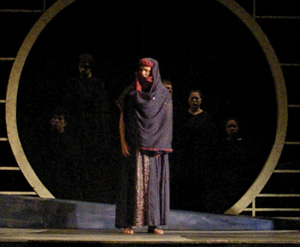
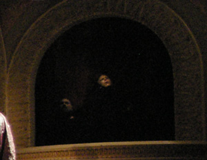
In our production, we wanted to surround Antiochus' space with the heads of previous unsuccessful suitors. (He's such a pleasant fellow!) This is a lighting issue, which was solved with lighting similar to that used in the main acting space. These heads show in the scene photo above. Enlargements of certain areas are shown below for clarity.
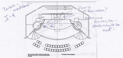
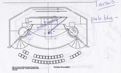
Tarsus -Desolate Wasteland
Research Image: Again, from Blumenthal and Taymor, an image from the Java, Sumatra and Bali production of TIRAI (1978-79) was a compelling source for the Tarsus look. It shows a group of huddled people with body paint, especially on their faces and legs. The darkness of the scene and the color and distribution of the body paint inspired the color and angle choices for the Tarsus scenes.
Director notes: Jeri had described Tarsus as "a waste land" and as having "starving people."
Descriptive lighting adjectives: wasteland, dim, chilly, damp, clammy, desolate, sickly blue
Rehearsal Sketches:
The scene onstage
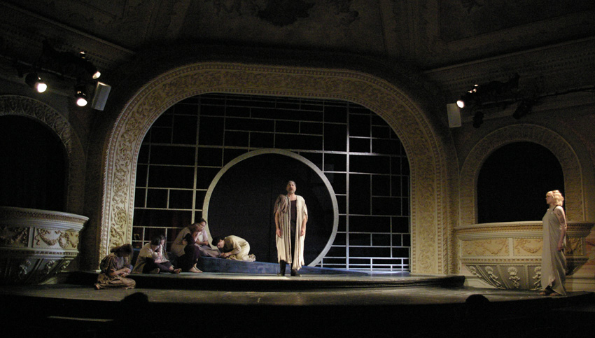
From the rehearsal sketches, you can see that I was trying to decide whether the pale blue should come from above or from the floor. I made the choice by doing both. The unit from above intentionally streaked the set, making a visual signature for Tarsus. The unit on the floor washed the starving masses.
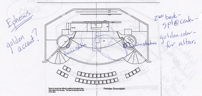
Ephesus - Classical Refuge
Director notes: Jeri had described Ephesus as "classical and feminine"
Descriptive lighting adjectives: feminine, classical, concrete, sense of higher power controlling for the good
Rehearsal Sketch:
The scene onstage
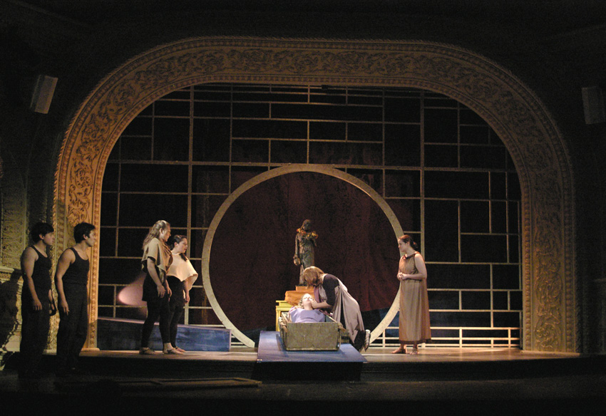
This photo is a perfect example of the live nature of theatre. The idea for this scene was a warm golden light. My backstage crew forgot to do the intermission color change in the floor mounted specials. If it were correct, the proscenium would glow a beautiful gold. Best to make these mistakes during a dress run rather than with an audience! Because of other units used in this look, there is still some golden color in this photo.
Mytilene - Shadowy Brothel
Director notes: Jeri had described Mytilene as "a very dark place"
Descriptive lighting adjectives: brothel, dark, shadowy, mysterious, unnatural
Rehearsal Sketch:
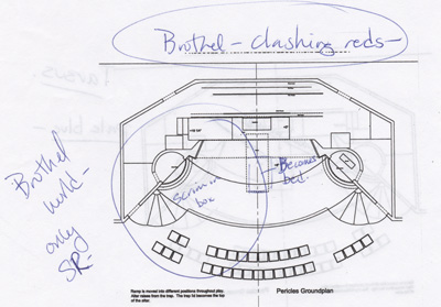
The scene onstage
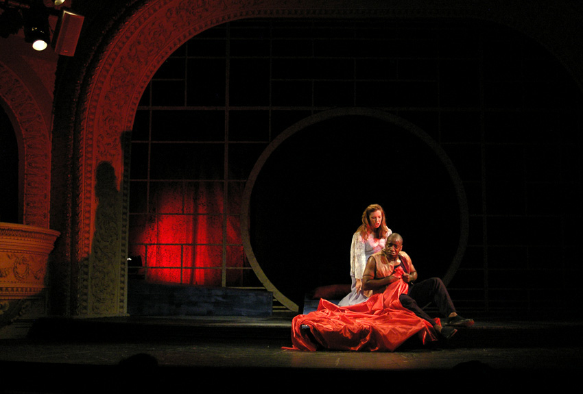
This scene achieved a sense of night and privacy despite the wide open stage space.
This production was part of a very satisfying summer season. It was artistically fulfilling to create all the specificity for this show from a plot that was also used to light 4 other shows that performed in rep with this one. Many people view this situation as a limitation. It doesn't have to be. I have a fondness for rotating rep and love the challenge of making the shows fit together.
For additional show photos, please see the PERICLES gallery page.
Return to Process Homepage
